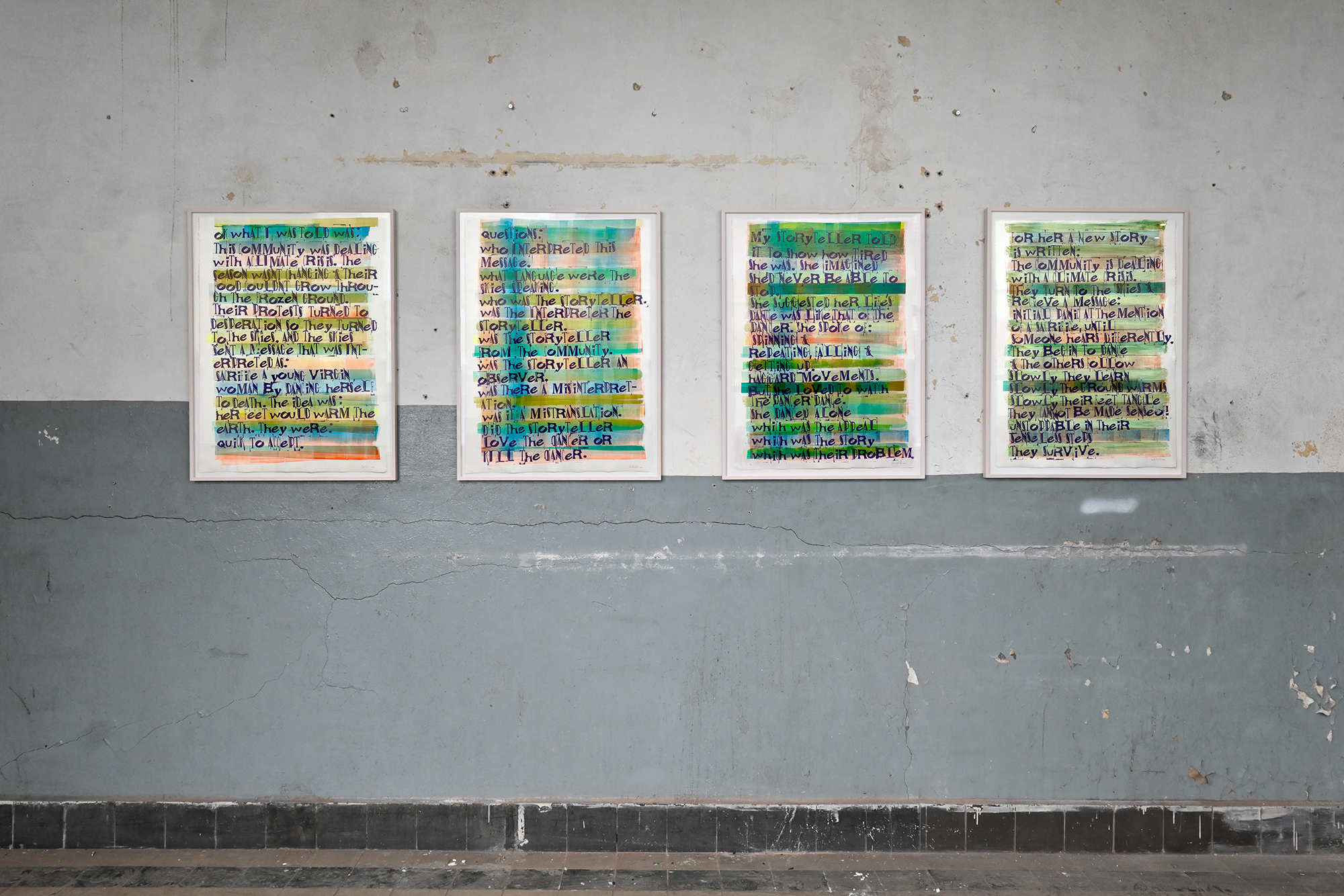
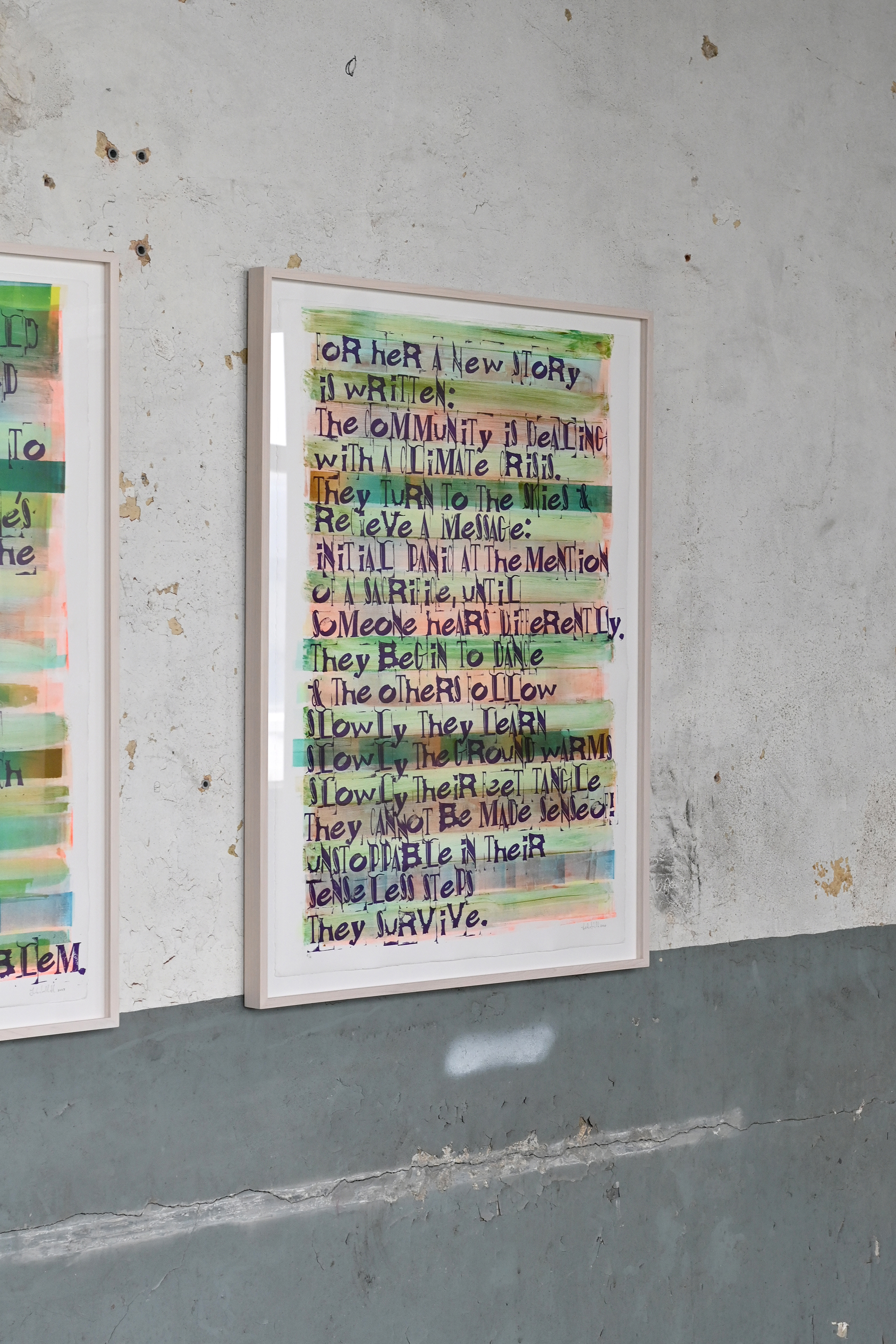
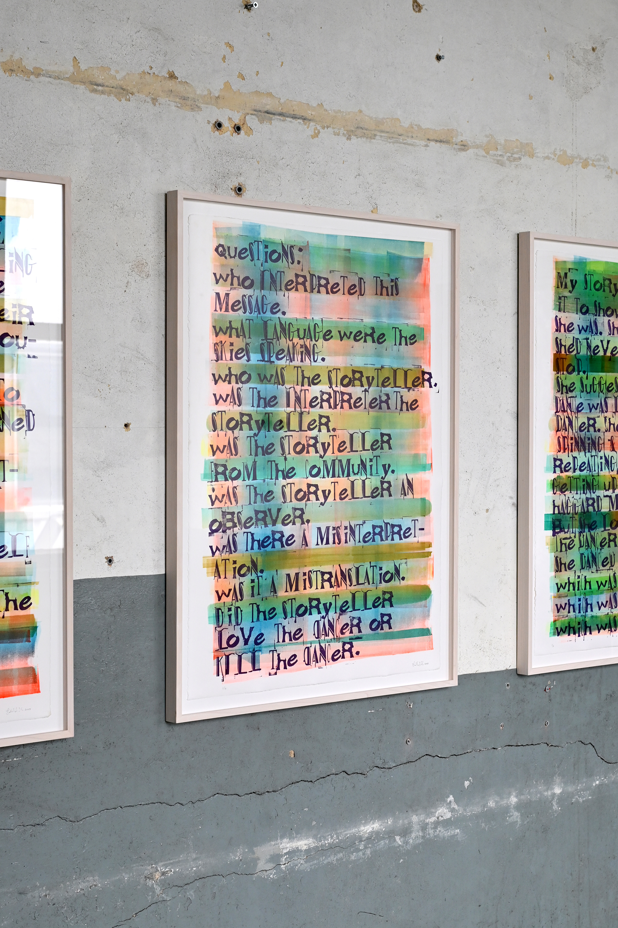
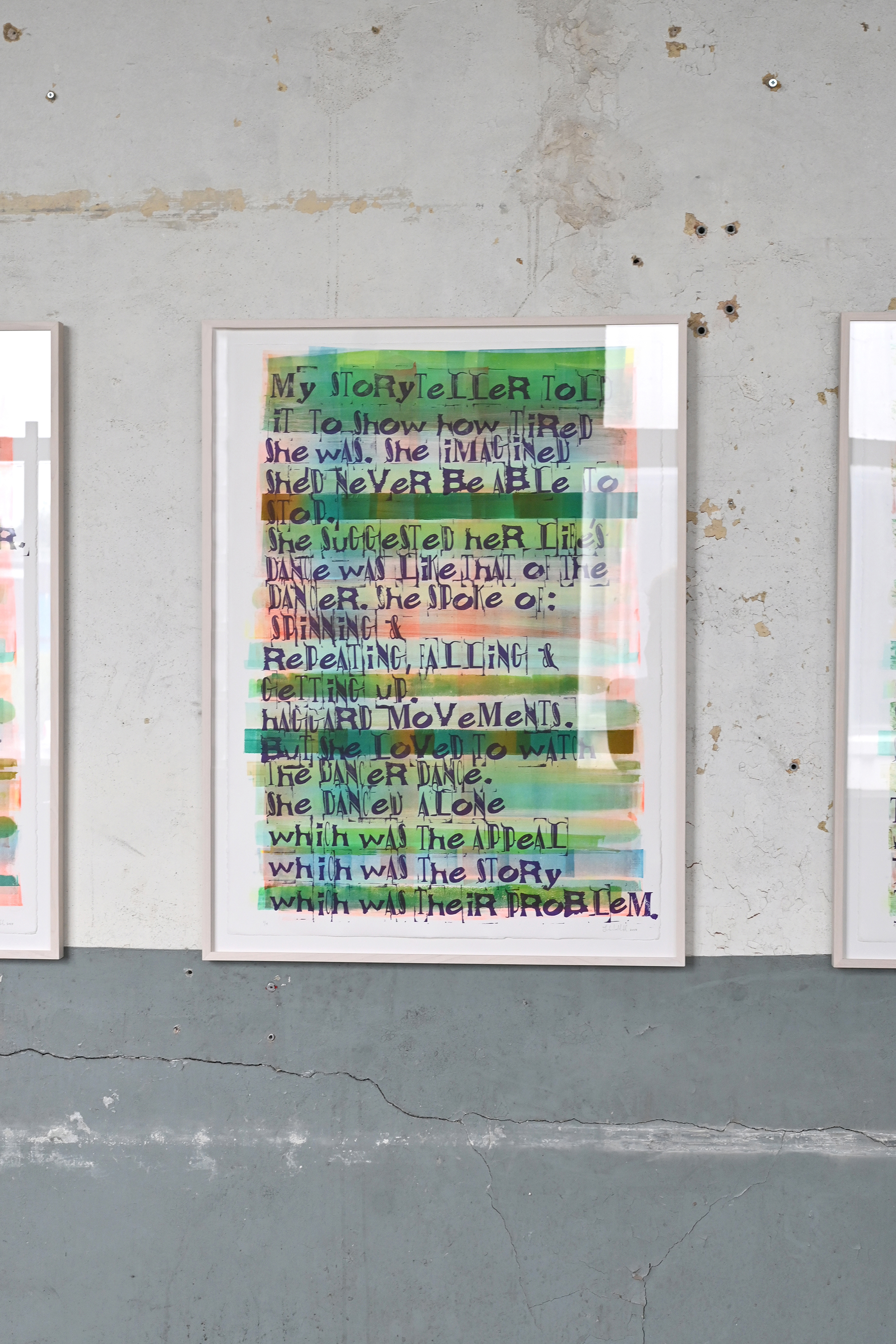
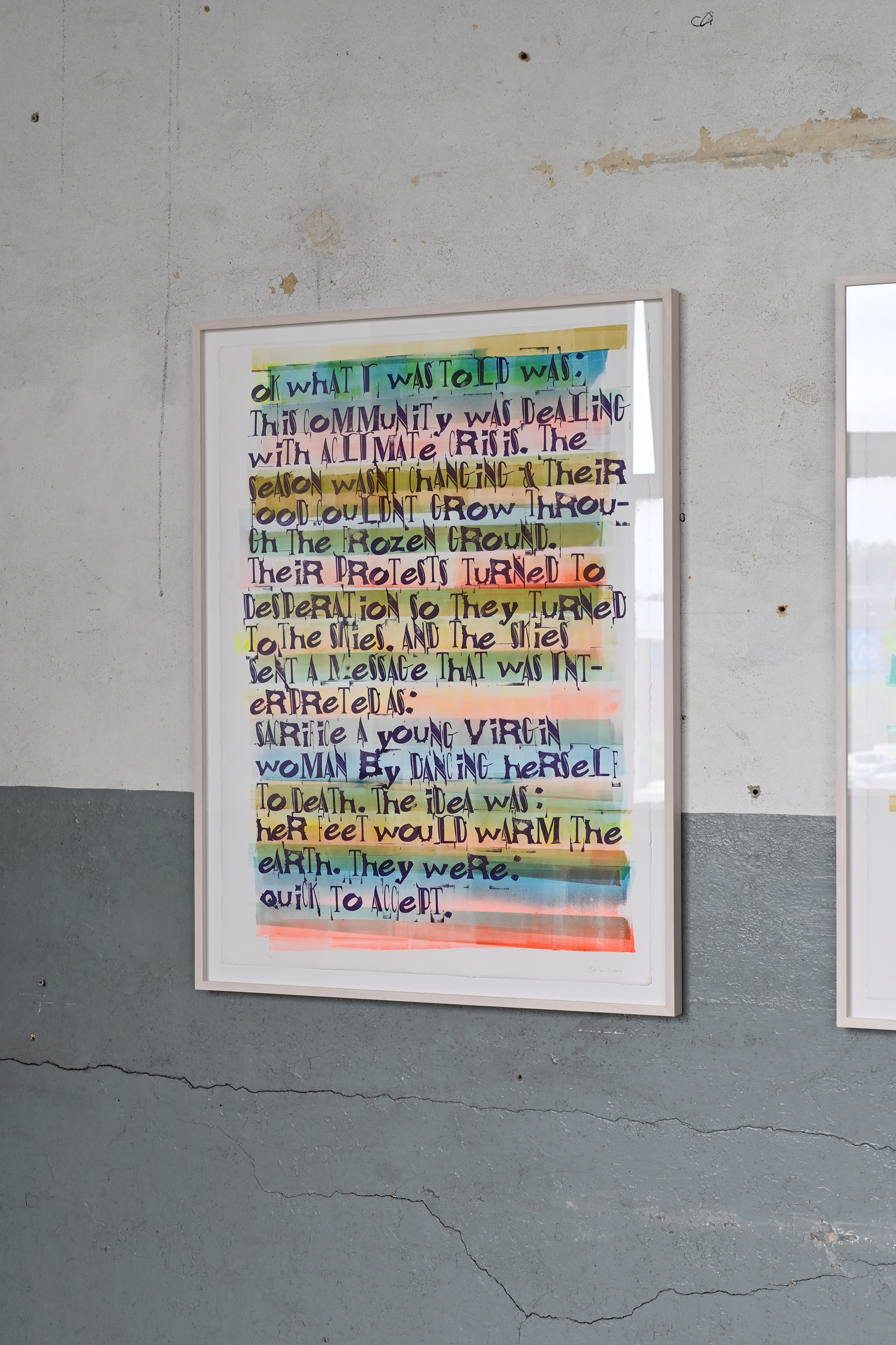
Ok what I was told was
text-based print work in four panels Exhibited at BRUTUS (Rotterdam, June 2024) and Art Brussels (Brussels, April 2024)
Ok what I was told was is a text-based work in four panels. The text, hand-stamped with custom letter stamps on an offset monoprint that continues to change as the panels progress, begins with the story from Igor Stravinski's Le Sacre Du Printemps, and proceeds to rewrite it. The new version is a revision that questions the original expendability of a gendered body, and refocuses on shared care and attention to collective surroundings in a speculative world that sits outside systems of exploitation, extraction, and consumption.
The letter stamps are based on letters from storefronts and signs of independent businesses (both shuttered and still open) in some of Toronto's west end neighborhoods, which are rapidly being redeveloped. They were turned ino the digital typeface RONO, which can be downloaded here.
This work was made while in residence at the Frans Masereel Centrum in Kasterlee, Belgium with the technical support of Ivan Durt.
